Thursday, September 26, 2013

Homuculus: by Hideo Yamamoto


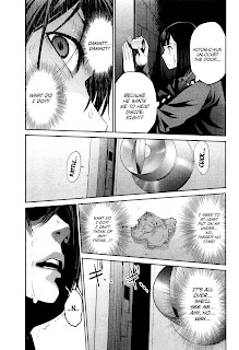
Homuculus created by Hideo Yamamoto, is another manga that has caught my eye because of the style.  The style is kind of like Prison School's, it switches between anime and realistic, but what really draws me in is the detail they put into texture, such as metal, sand, and water.  Also on the first page I present it shows the characters as silhouettes and you can tell which is who because of the eye expression which I thought was really neat.  The pages are set up with 1, 4, 5, or 6 panels, sometimes they are slanted and sometimes there is white space where one of the panels could be stretched out more.

This comic is under a horror label but I really don't see it as that I just see it as very weird and creative.  The story also caught my interests because it talks about the 6th sense and that the main character can see people for who they truly just by covering one of his eyes.  The most interesting part of this comic to me is when he finishes helping someone he carries the burden of said person, such as his arm turns into a robotic arm or his leg turns to sand, it's very interesting.

I finished this comic and was quite entertained by it.  The ending was somewhat un-expecting and kind of sad, but I recommend anyone to read it.  It makes you wonder a bit.


Thursday, September 19, 2013

Whomp!: by Ronnie Filyaw


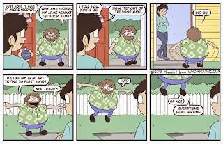
Whomp! created by Ronnie Filyaw is a comic series about Ronnie.  The comic series is a comedy.  Ronnie portrays himself as a rounded (fat), depressed, and awkward character, but enjoys the simple things in life.  The simplest things he does either end badly or awkwardly.  After reading so many of these I've started to love Ronnie's character, in ways the situations he gets in can be related to everyone, we all have awkward moments and it seems he tries to touch up on every awkward moment imaginable.  What draws me to this comic is the art style, it's very rounded, all the character design has a certain style, and it's colorful.  The first impression I got was I thought the comic would be more childish (kid friendly) but the text completely changes the how I see the images.

How the comic is laid out is usually six panels, read left to right, horizontally.  Sometimes he uses less panels and sometimes he splits up panels.  Pretty standard for a webcomic.

This comic is a on going comic and it updates 2 or 3 times a week.

So far this is one of the most amusing comics that I have come across so far and can't wait to see what antics Ronnie will get himself into next.

Thursday, September 12, 2013

DC: Harley Quinn Discussion


After reading the article from Jezebel on DC comics' recent artist competition to illustrate 
a scene of Harley Quinn (from the Batman series), committing suicide and in the nudewhat are your thoughts on the controversy?

After reading over the 4 different suicide panels for Harley Quinn, I can understand why people would be upset.  The second panel being that Harley Quinn wears a bikini made out of chicken in hope of being eaten by alligators and the fourth panel where Harley Quinn is naked in a tub with electrical appliances above her ready to drop.  These two panels are defiantly sexualizing suicide but in a way I don't think that was the intent of the contest.  But I also recall in old comics of DC, Green Lantern's girlfriend was killed and stuffed into a refrigerator, didn't see to much of a backlash with that but still this contest wasn't a good move on DC.  I think they were trying to make it comical.  Here is an example of an artist named JollyJack:


As you can see Jolly didn't sexualize Harley to much especially the fourth panel you only see Harley bare naked arm.  Also these panels seem quite humorous to me even though I don't agree with the suicide aspect.  So as you can see submissioners don't have to follow the contest's request to the tee they can still get the point across without sexualizing anything.


Why is the objectification of women in comics and visual culture in general problematic? 
How can it be avoided or addressed in our own comics? 


In today's comics women usually look skinny, big chested, and beautiful.  We all know not all woman look like that, but it seems all heros and villains who are female have these qualities.  While male characters come in all shapes and sizes.  Women who may read comics can see this as this is the ideal figure for all women heros which can upset them.  If we want to avoid this problem we need to make a variety of characters man and women with different body types, faces, and personalities.  These characters need to be main characters not background characters, because big comic companies usually do that to these types of characters.

Thursday, September 5, 2013

Kangoku Gakuen (Prison School): Hiramoto Akira


Kangoku Gakuen aka "Prison School" created by Hiramoto Akira is an over the top comic or manga.  What drew me to this comic was the style, It's switches between a manga and realistic style.  Hiramoto goes into real detail when it zooms in on a characters face, such as the 3rd comic page provided.  I also love the use of shadows especially on the character with the hoodie.  Also I love the talk bubbles as you can see in the 3rd page provided the character with the glasses is crying and the talk bubble is all distorted and shaky showing emotion.  I also love all the character designs especially the big fat guy with a tiny face.  The comic panels either are in formal or slanted formation.

The comic is still on going usually updates twice a month with new chapters.  I also realized going into this comic there is a lot of crude language and sexual scenes which makes this comic's target audience older teens and adults, but in all it has a great story going with a lot of humor.

Tuesday, September 3, 2013

Supernormal Step: Michael Lunsford


Supernormal Step is created by Michael Lunsford.

I stumbled upon his "other" work before I found out that he was also a comic artist.  Michael's work caught my eye because of the line and color use he uses.  Dark lines that outline the character's body to the thin lines that define wrinkles or cheek bones.  I also loved the character's eyes of his characters many variations.  His style has a disney/anime combination which I really enjoy.  Michael's character designs are also quite eye catching; from the human figure, to aliens, and even a stuffed rabbit.

The Flow of the comic is also very well done.  He hes regular panel layouts, panels within panels, and even panels that are slanted with little space to keep the panels from bleeding into each other.  Michael also seems to understand which fonts to use when text isn't just a normal conversation.

Supernormal Step is an on going comic since 2009 and Michael's art style has changed greatly over the years I will continue reading up on his story and also see his art style continue to show improvement.